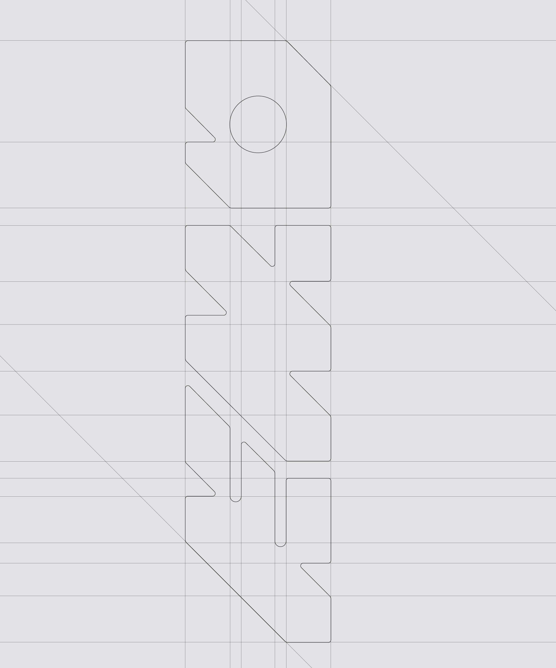
The rebranding of EMO translates a highly technical process into a clear and contemporary visual language. Rooted in extrusion, shaping materials like plastic and metal, the identity reflects both precision and transformation. The logo builds on extruded cube forms, balancing sharp contours with soft edges. A grid system derived from technical drawings extends this logic across the entire brand, connecting product, process and design into one cohesive system.
CLIENT
EMO Extrusion Machinery organisation
DELIVERABLES
Corporate design, Logo
CREDITS
PROJECT LEAD, Strategy:
CHRISTINA LUGMAYR
ROLE
ART DIRECTION, Design
Awards
CCA Venus bronze for logotype